All work05 / 06
Woodward Birmingham Financial Group
A six-page website for a commercial mortgage banking firm with more than $2.7 billion closed across 16 states, rebuilt from the content up. The same firm and the same words, reorganized so the track record leads, every page works on a phone, and the pages load in a fraction of the time.
Live at woodwardbirminghamfinancial.com
- Role
- Audit, content, design, build, launch
- Platform
- Website
- Stack
- HTML, CSS, JavaScript, Cloudflare, Supabase
- Status
- Live
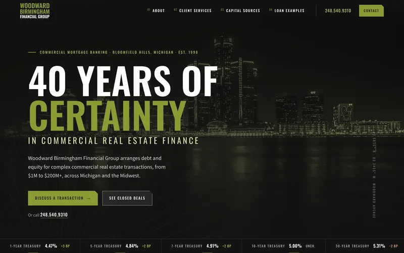

Captured from the live site on 27 October 2026.
01
The problem
A firm with $2.7 billion in closings had a website that hid them.
Woodward Birmingham Financial Group is a commercial mortgage banking firm in Bloomfield Hills, Michigan, founded in 1998, with more than $2.7 billion in closed transactions across 16 states. Its old site was built page by page in WordPress custom HTML blocks, and it showed.
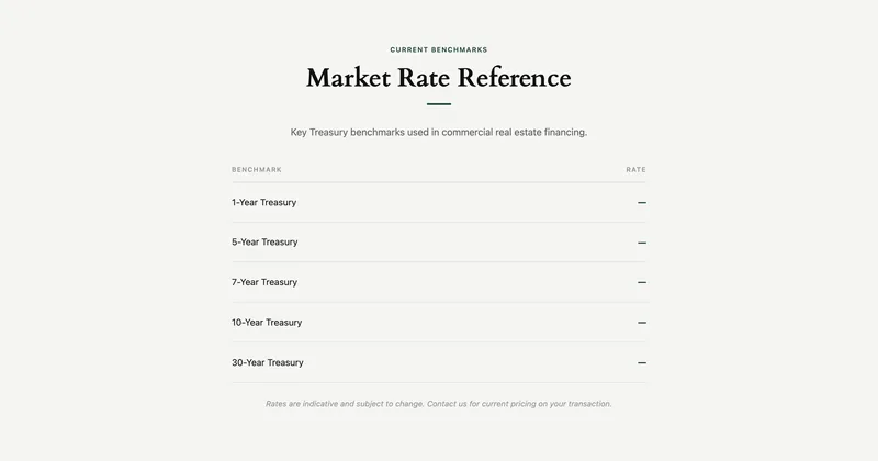
Three of the six pages were wider than a phone screen, so text was cut off and the page scrolled sideways, and the home page switched its services off on phones altogether. Three pages each downloaded 5 to 7 MB, most of it one skyline photo. Twenty-three accordion and deal rows could only be opened with a mouse. The Treasury rates table showed a dash in all five rows.
And the strongest proof was buried. The closed deals and the 91% closing rate never appeared on the home page, and the deal write-ups sat in a pop-out panel behind a click. Three pages used a photo-led look and three a newer type-led one, and figures on one page contradicted figures on another.
02
What we built
One design system, one stylesheet, and a header and footer written once.
- Six pages
- Home, About, Client Services, Capital Sources, Loan Examples and Contact, in HTML, CSS and JavaScript with a build script and no dependencies. Every one of them works on a phone.
- Content
- The old site audited, then the copy rewritten and reorganized with the firm's leadership. Figures that contradicted each other were reconciled with the firm, and claims it couldn't stand behind came out.
- Deals
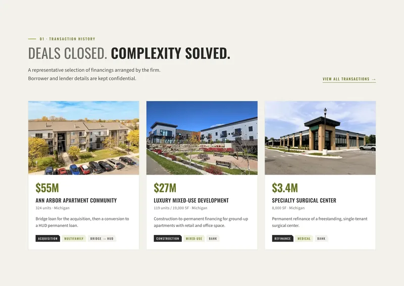
- Nine transactions, each with its photo, tags and full write-up, all visible, with a filter by acquisition, construction or refinance. Services and capital sources point to the closed deal that proves them.
- Live rates
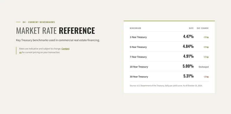
- The table reads the U.S. Treasury daily yield curve, shows the date and the day's change, and hides itself if the data goes stale.
- Capital hub
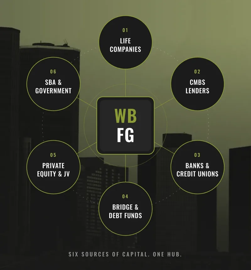
- A diagram of six capital sources, each node linking to its explanation, and a lifecycle card of five investment stages, each jumping to the service that fits it.
- Contact form
- Core fields plus three optional deal questions. A visitor arriving from a deal carries that deal into the form, and every submission is stored and emailed to the firm with the visitor's address as the reply-to.
- Images
- Every photo resized and converted, with a portrait crop of the hero for phones: 83 files in 4.7 MB where there were 17 in 48 MB. Deal photos that showed a name were retouched.
- Logo kit
- A new mark for the firm, delivered as a kit: the wordmark with its tagline, a compact wordmark, and a square mark, each in four color versions as vector and PNG, with a usage guide. The site carries it.
- Launch
- Hosting on Cloudflare, the DNS move, redirects, security headers and SSL, all in place before the switch from WordPress.
03
Decisions that matter
Show the proof first.
The home page now leads with the figures and three closed deals. The 91% application-to-closing rate moved from a single inner page to the home page, and the write-ups that used to open in a pop-out are simply on the page, with every service and capital source pointing to the deal that proves it.
Every page works on a phone.
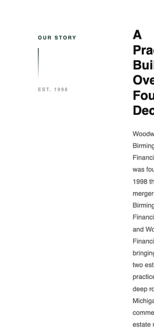
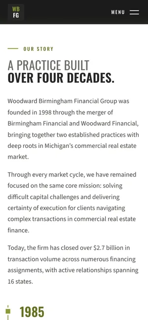
On the old site, About, Client Services and Contact were 780, 461 and 574 pixels wide on a 390 pixel phone, so text was cut off and the page scrolled sideways, and the home page hid its services below 768 pixels. Every page was rebuilt on one responsive system, and the hero photo gets a portrait crop for phones.
The same About section, before and after.
Nothing hidden.
Accordions and pop-out panels were replaced with content that is simply on the page. Every service, capital source and deal write-up can be read without a click, and search engines can read it too. The 23 controls that needed a mouse became none.
The capital hub draws the six sources as a diagram, and each node is a link to its explanation.
Rates that cannot go blank.
The old rates table showed a dash in all five rows. The new one ships with a snapshot and refreshes itself in the browser from the Treasury's daily yield curve, with the date and the day's change. If the snapshot is more than 10 days old and the Treasury can't be reached, the section hides rather than showing empty rows.
Confidential stays confidential.
The site promises that borrower and lender details stay private, but three photos carried readable names. Signs were retouched out, one sign was cropped away, and one photo was withheld. The originals were left untouched.
04
By the numbers
- percent lighter: all six pages, 19.2 MB to 1.4 MB
- 93
- pages wider than a phone screen, down from 3 of 6
- 0
- of 148 links inside the site that resolve
- 148
- of 5 Treasury rates shown, dated, up from 0
- 5
05
Where it stands
Live today
All six pages at woodwardbirminghamfinancial.com. Rates, the deal filter, jump lists, the lifecycle card, the capital hub and form validation all work, and the contact form delivers.
Next
The firm's sign-off on the drafted process section on Client Services, and a photo for the retail portfolio deal, which shows a plain panel until then.
After launch
Changes go live the same day they are asked for. The form and its email delivery are watched, and the firm has a direct line to us when anything comes up.
Have a site that is overdue for a rebuild? Tell us what it needs to do.